LOVE LOVE LOVE creating fabric and collections. CAD!
I am steadily trying to improve my drawings, aiming to cope with me eye for perfectionism this is ironically is perfect for me! I love the sleekness and tidiness. Fashion illustration are raw and edgy which is amazing, until I can find my rhythm and technique in that field, CAD is serving me well.
We didn't have long to design these, but I think I could happily spend a lot of time making some fantastic numbers.
Lucia Giacani
YES YES YES, another artist/photographer, who just makes me feel tingly and excited, I am the biggest fan of editorial work, it just relates to me so much, and I feel it is an amazing access to expression. I love the magical and surreal qualities of this genre of work.
Lucia is a woman, which totally surprised me! I generally got the vibe that this was the work of a male?! I really don't know why, I wonder whether it is because all the famous artists of great work especially the ones I have been researching like Da Vinci and Michael Angelo, I gave just had male creative genius's on the brain.
She lives in Milan and has over ten years of experience. Born in Jesi, Italy in 1976 she has lived in Rome where she graduated from the Advanced Institute for the Artistic Industries and where later on she has undertaken an intense photographic activity that has won numerous prizes and acknowledgments.
Her work specifically and individually has been hard to get information on, I personally would of guessed this piece as being Mother Mary related as there has been other pieces based on this, such as Jean Paul Gualtier, as you can see these images do have similarities, pale skin, head drapery, ok there is significantly bold colour differences but the overall theme I think is the same
The work above looks very realistic, also quite dream like, it has been photographed beautifully, the makeup and styling was by Aaron Smith Hendrickson, they seem to have went with a neutral nature theme, using the same coloured props. It work fabulously.
The image really make me feel so engaged, she looks so innocent and vulnerable, you could even say the same about Jean Pauls piece, although his does carry a more spooky skeletal essence.
The image has been taken whilst the whole team were present, probably tweaking along the way, also getting different poses to get the right shot.
Now taking a look at this piece, styled again by Aaron Smith Hendricks, this is totally different colour scheme, all black with specks of colour, your would expect his to be frightening and scary, yet you can still see the innocence and vulnerability of the image. You can tell this is a excellent model and design team, they have taken this religious inspiration detoured from the usual white and pure colours, and used the dark scary black, dark drapery and yet its still a capitulating an pure image.
Collection Developed 'VEST ALMIGHTY'
Vest Almighty, if you haven't already gathered is a play on words, christ almighty we normally hear, and probably pelted with rocks back in the day. BUT fear not nobody shall be condemned to such torture, well unless you fancy it? Which brings me to my point, this sought of joke and banter would be something I would expect amongst my target audience, 17-27 year old males the brighter collection more aimed at your young-on 17-21 and darker collection for the up to 27's.
I have started off with using the stained glass window image, which I then slotted into vest space using the magic wand tool, I then used filter gallery, and selected the stained glass effect sequence, which contorted the image and gave only the colours from the image, keeping in theme with Faith and religion. The colours will suit the younger range from my target audience 17-21's as they are bold and brash with their style.
The darker collection I took an image from my sketch book played with edges with the magic eraser tool, (I seem to be using all the magic options?! Maybe this is just a MaGiCaL AlmIgHtY Collection.)
I used the crop tool and took the eye section of the first print and made a caterpillar like shape, copying and pasting the same image over and moving it from left to right continuously.
I prefer the bottom darker collection its more bolder, dramatic, and consistent. I felt it was important though to play with colours and shapes with the brighter vests, to really get closer to the vision of my actual target audience. Knowing what isn't working to exploit the working effects.
The message from this collection is one of a more artistic one, previous obvious religious images have been made into more of a patterns and into colours so its not really a direct message.
T shirt collection ' LADY J'
T-Shirt print samples
Tee shirt print trials and final Tee shirt collection.
I chose the hand as its my friends new tattoo, which was very coincidental as its a mandala! A mandala is a image that summon a particular energy and power that can help, improve, or which ever mandala is used evokes a particular attribute. I have kept the hand photo in all it natural colour slightly tweaking the contrast. Its a photo I took myself. I do like it although I would love it as a photo for my wall more, I like art and when I use it for one thing I want to use it for everything else.
It makes me feel happy as I know what the mandala represents, success and happiness...who would be happy with that.
Image top middle and 3rd top right, are my more abstract t-shirt prints, its of an image I drew representing a goddess called Kali, who dances on the bodies of the victims she kills, those who try to get in her way or harm her children. She wears there body parts as belts and necklaces. How exciting!
I used my own drawing, uploaded it to photo shop, changed the contrasts to get the image all black duplicated it and inserted a crucifix in the background. I am happy with my new photo shop skills as this is the first time I used it, I don't feel 100% with it as a product, as it has had more of my attention in knowing how to use the tools I will need to make a good product.
But for all the art, and quirky dressers out there looking for something different I can see them liking it.
The 3 bottom images, where a little bit more fun, I was a tiny bit more aware of the tools so I could experiment more, I used 2 layers merging them together, and altered the colouring with the saturation tool. It was the silhouette of a image from my sketch book where I added a crown of thorns. This is very symbolic as its a woman's head I added the thorns to, not a male figure, I was playing with the idea of changing the gender roles of the significant religious figures, Jesus and God, being females.
I think my message sort of sends a mixed one, and slightly glamourises this typical image and makes it a bit....sexy. The silhouette of the woman is very provocative, and could be great hit with the my target audience, of 17 to 27 year olds males, the raging hormones of the 17 year old with added desire to want the newest original prints, I think this would be a success. Then as we push into our mid 20's we could be looking at a more in depth understanding of he prints, the over 21's being aware of the crown of thorns on the ladies head. This being a indication of swopping roles or the stereo typical Jesus figure.
The theme of my mood board is playing with quirkiness and seriousness. I have an image of Jesus with a machine gun and a cigarette pulling a rather smug face.
The composition of the images took me the longest, putting them in the correct place and tweaking the images so it fitted and was the right size and colour I have used my own images, images/drawing/photographs and images from internet, I also manipulated some images to created more creative effects.
I have looked into Christianity, Wiccan, Greek mythology, and the amazing Salvador Dhali, one of my favourite artists, who inspires me so much making the cosmic realms and symbolic messages come to this world. I love his work, and he is just a creative genius.
I am still trying to build my photo shop skills, the mood board being my 3rd time on photo shop. Overall I am happy with the progress and know more is to be made.
Salvador Dhali was born in 1904 he was Spanish surrealist painter. His first major piece that was well known was "The persistence of memory" which is still to this day referred to in pop art culture.
The persistence of Memory 1931
Salvador's work has touched on religion, he painted a painting called
"Christ of St John of the Cross"
He had a powerful cosmic dream, which represented the nucleus of an atom, it then took a metaphysical sense and it was considered to him as the union of everything, which then transcended into the image of Christ on the cross. It was very specific in how he was to be hanging on the cross, so much so he had has friend suspended from cables so he could see how the body would hang for his painting.
Salvador' St John of the cross
St john the cross
Salvador is seemingly influenced by other artists, on in particular was St John of the cross. He took inspiration to create his painting on the left from the one on the right
The composition of the image had been based on a triangle and a circle, his arm forming the triangle and his head the circle, its seen as the trinity and the circle represents unity.
This painting is another surreal piece from Salvador he has used oil paints which he uses a lot, I think this gives his images a real life finish, the images seem to move and the dimensions draw you in, this image was 80.7in x 45.67. All the colours used are very natural and I think this was an important factor the dream he had was so specific I felt he took it on board as his duty to recreate the
dream as accurately as possible.
Gilbert and George setting themselves a standard to allow them to stand out, are always seen in their well kept appearance and most importantly their suits. They claimed its was love at first sight, they claim to have been married since 2008 and the two first met on 25 September 1967.
An iconic piece that first came about was "The singing sculpture" in 1969. Where they both decided that they weren't separate from their work, and they had to be their own living art, so they painted their faces in metallic powder and sung a song for up to 9 hours, this captivated their audience and they claim it had and mesmeric effect on them sort if hypnotising them.
They where out and proud conservatives, this made them laugh, as conservatives were not supposed to be artists, they never hid the fact that they loved Margaret Thatcher, either, and they adored how Prince Charles dressed. I strongly feel they took inspiration from the prince, as they are iconically known for dressing smart in their suits, and most of the time never being seen one without the other.
Their work was very much influenced by their home town, with all the urban rebel and spray paintings, this inspired a lot of their work, with the rawness, bright spray paint colours, and hear of there city. They said that;
"Nothing can happen in the world that couldn't happen in the west end"
I think this gave them a sense of contentment, the feeling they had all they needed to make fantastic sculptures. They call all the art "Sculptures" even their painting, (painted sculptures)
Gilbert and Georges work as time has passed has meant different things, their first piece of work being "The singing sculpture" was about them being naive, innocent artists, wanting to express themselves and to be living examples of their own work. There work today you can see they are expressing government issues, and the dark and light side of the matter as seen below.
To me this is religious and political figures and what seems to be almost
satanic/demonic looking figure in the middle, with all thee reds and dark colours, If any side was on the side of good I cant Imagine the centre image being what I have depicted, centred evil would not be mediator between the two? It would be something of a neutral stature, so this to me is saying they are both as one as the middle
(all the same).
This you could say is a more easier example of their work to understand. The photo below is called "Flying shit,Naked Shit Pictures (1994)"
This made me laugh coming across this, an actual LOL!
(I never use that abbreviation)
How could anyone interpret this?
Are they sharing a secret joke?
Are they mocking todays art?
Or is it telling us sometimes they are just having...a shit day.
For me its all of they above, they seem the type of character who would play an mess around with society, this in a very abstract piece, I could imagine they conspiring to put a piece out there and it be loved no matter how the "shit" it may seem.
Shitty or not shitty I think its clever.
(What is even funnier, they used their hands to collect to the poo, brilliant!)
The composition of their work is somewhat bright bold and a lot of the time symmetrical. Making it a master image, in total balance with its self being the same on both sides, strangely enough, symmetry is seen as the key factor
in defining or measurubg a persons beauty. Is this a subliminal detail bringing an admiration to their work from their audience?
Their colours in some work are be bold and brash, I think it works quite well. There work comes in all sizes, and I don't think this is of extreme importance to them as much as it would be to the likes of Michael Angelo, or Leonardo Da Vinci.
Here we have Leonardo Da Vinci painting, this is his work on the Sistine chapel, now the composition of this compared to Gilbert and Georges work are worlds apart, the above image is on the ceiling of the chapel measuring an impressive 132 x 46 feet! As you can see the size is of much importance.
It would an extreme disadvantage being 230 x 680 cm compared to Gilbert and Georges
"Us in nature painting".
Whilst performing, they made 'Postcard Sculptures', 'Magazine Sculptures' and were early pioneers of video art with their 'Sculptures on Video Tape' such as Portrait of the Artists as Young Men and In the Bush, both from 1972.
Between 1970 and 1974 they executed thirty 'Charcoal on Paper Sculptures', large drawings in charcoal with text which in some instances completely covered the gallery walls and ceilings. In 1971 they made a series of paintings in oil on canvas entitled The Paintings (with Us in the Nature), a body of work which they again referred to as 'sculpture'.
Even though they where painting or drawing they always referred their work as "Sculptures"
Photography was to become their primary medium and, from the mid 1970s to the present, they have produced an enormous body of wall based works.
From the outset, they used a grid to enable them to work on a large scale, and the early photographic work was initially limited to black and white, with the latter addition of colour. In the early 1980s they began to work on an even greater scale, introducing a more saturated field of colour and using ever more powerful and uncompromising imagery to explore their unique vision on all aspects of human nature.
??
-Gilbert and George V.s Andy Warhol -
Its clear to see that there work is both share the same qualities, the bright vibrant colours somewhat animated and cartoon like, I think over all Gilbert and Georges work is very original it works, what I love most about them is that not only are they business partners but partners in love and partners in crime. I like their work but don't think I would take anything from it to influence my own, if anything maybe the bold colours, their work to me is more on the realms of the physical, my designs are very much on the esoteric planes of energies surrealism, editorial couture.
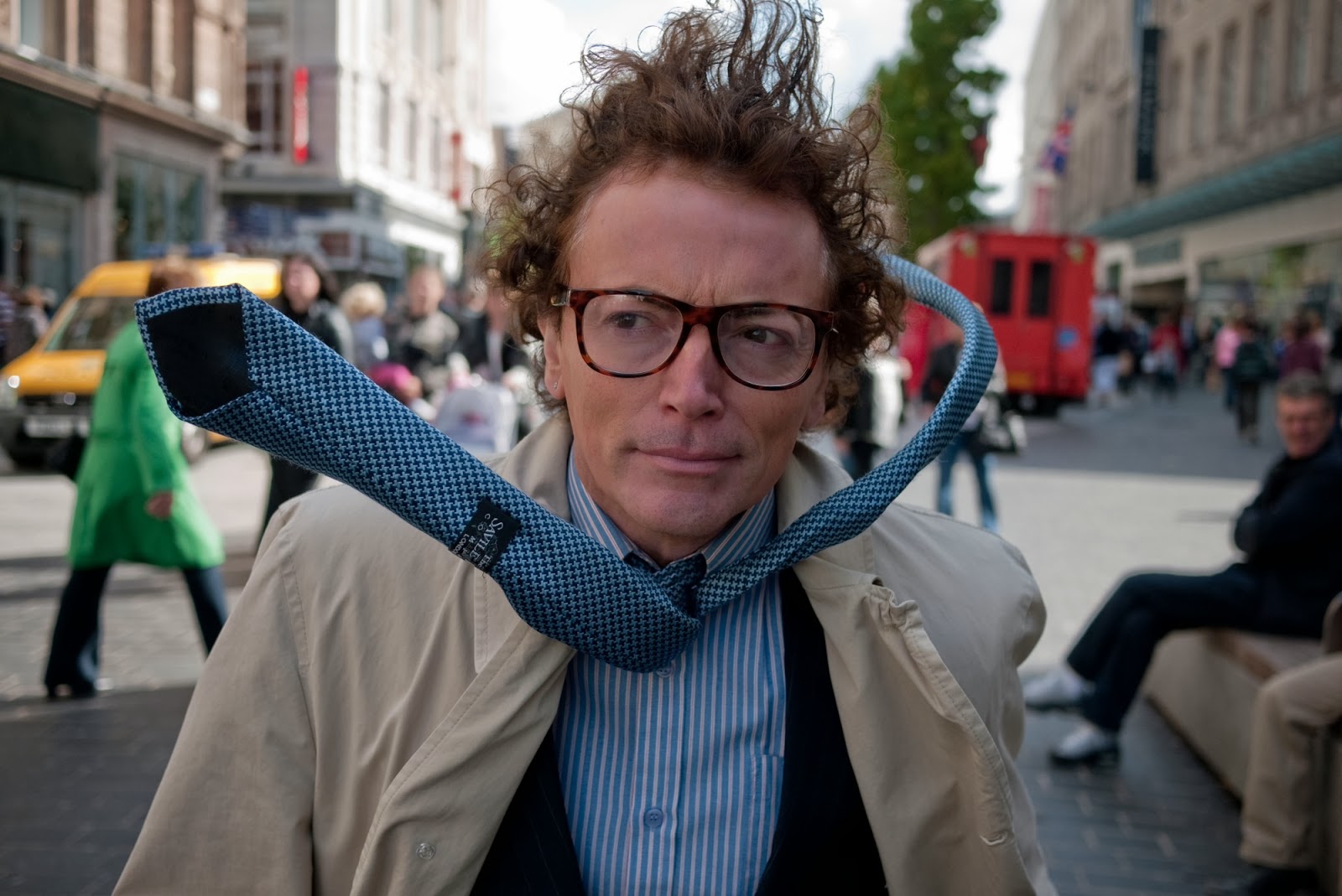
But I do think there are people out there who would be inspired by their work, and maybe be even to make money from it....here is a photo of a gentlemen in my home town that I see ever other day, and he is his own art work, his own sculpture, just like how Gilbert and George believe themselves to be. His clothes are laced with wire and he looks like he is being blown away constantly, even though he is static, and there is no wind. Perfect example of being the art.


